Vivid Colors Bridge the Past to the Present in This Updated Victorian
 “I could picture the entire house in my head way before it was done,” says Emma Pocock, one-half of Turner Pocock Interior Design. She and partner Bunny Turner work from London and Geneva.
Updated patterns, textures, and colors distance this London Victorian terrace house from conventionality, yet enough unique details remain to mark its original period.
“I could picture the entire house in my head way before it was done,” says Emma Pocock, one-half of Turner Pocock Interior Design. She and partner Bunny Turner work from London and Geneva.Pocock’s vision is understandable given that this was, at the time, the first home she shared with her husband. “It was just dirty,” she says of how they first found the home. “The walls were a weird neutral tone between pale pink and orange, and there was very dirty shag pile carpet.” The last renovations had been completed in the ’70s and ’80s.
They gutted the interior and started from scratch. Having a clean slate is helpful, but Pocock’s profession presented some drawbacks. “The biggest problem when you’re an interior designer is that there are so many things that you like. You constantly have to rein yourself in.”
The designer and her business partner like to begin projects with a design direction meeting. “We ask clients what they like and dislike,” she says. “We look at pictures to see what style they want. Once we feel relaxed in the direction they want to go, we design the whole house. The way we design for clients is very complete.”
Pocock held a similar design meeting with her husband. His direction was “make it colorful,” she recalls. “If I showed him anything and asked what color he wanted, he picked red or blue or another primary color. I had to stop asking.” But it’s not that Pocock is opposed to color. “I love color, but you also have to balance it with neutrals. And by neutrals I don’t necessarily mean white,” she says. “I think blacks and grays and some dark blues are quite neutral.”
The double reception rooms in the home presented a challenge. You must walk through one to reach the other, requiring the rooms to feel connected yet distinct. The first room contains a chaise longue, a wedding gift from Pocock’s business partner. It’s covered in green-and-blue Carnival fabric from Christopher Farr. “It’s mine and Bunny’s favorite fabric,” says Pocock. “We have to limit our use of it. We love it so much we’d put it in every house.”
A bright-pink bolster sits on the chaise and a zebra rug rests beneath it. An old writing desk stands in a niche. “The desk belonged to one of our grannies,” says Pocock. “We think it’s important to layer antiques with new stuff. A home should give the feeling of being put together rather than everything being bought in one day.” The butterflies displayed above the desk came from another granny.
In the second reception room, your eye is drawn to the brilliantly colored Natasha Law art above the fireplace, a gift from Pocock’s mother-in-law. Black bookcases trimmed in white flank the fireplace. Dark slate provides the fireplace surround and hearth. And the Carnival fabric appears again on a loveseat.
One of the most neutral rooms of the home is the kitchen. Upholstered chairs sit at the table ends. Tulip  chairs originally from the liner QE2 (Queen Elizabeth 2) finish the seating. Dark lower cupboards edge the perimeter while open shelves sit above. “I don’t particularly like top cupboards,” says Pocock. “They make a kitchen feel claustrophobic, but you need storage. I don’t think saucepans or pots store well in cupboards or drawers. On open shelves, sets of matching saucepans and pots look really nice and they don’t get messy because there are only five things on each shelf.”
chairs originally from the liner QE2 (Queen Elizabeth 2) finish the seating. Dark lower cupboards edge the perimeter while open shelves sit above. “I don’t particularly like top cupboards,” says Pocock. “They make a kitchen feel claustrophobic, but you need storage. I don’t think saucepans or pots store well in cupboards or drawers. On open shelves, sets of matching saucepans and pots look really nice and they don’t get messy because there are only five things on each shelf.”On the opposite wall, there is a bar and computer station. Marquee lights spell out eleven eleven. The lights were a wedding gift for her husband, whose birthday is 11/11 and who considers the numbers lucky.
Marble floor tiles extend from the kitchen out to the garden. Glass doors framed in black metal separate inside from outside. The middle doors fold back on themselves creating a seamless flow from the house to the garden.
Cheery coral paint covers the home office walls. Three filing cabinets topped with a long piece of wood create a simple, inexpensive desk. “You can’t hang a chandelier in a room like this, but those horrible hanging shades where you can see the bulb are hideously ’80s,” says Pocock. A coral patterned fabric drum shade easily updates the fixture.
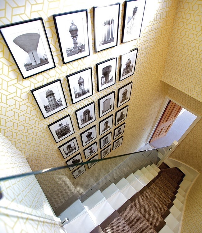
Yellow patterned wallpaper lines the hallway, and the hanging mask pictures are from Malaysia. “Hallways often get overlooked,” says the designer. “You can do fun things in hallways because you don’t sit in them all the time.”
The same sunny paper covers a corridor outside the master bedroom, which was created during home renovations. Shelves of shoes add color in a unique way. “Shoes are quite pretty. It seemed [like] a good place to store them.”
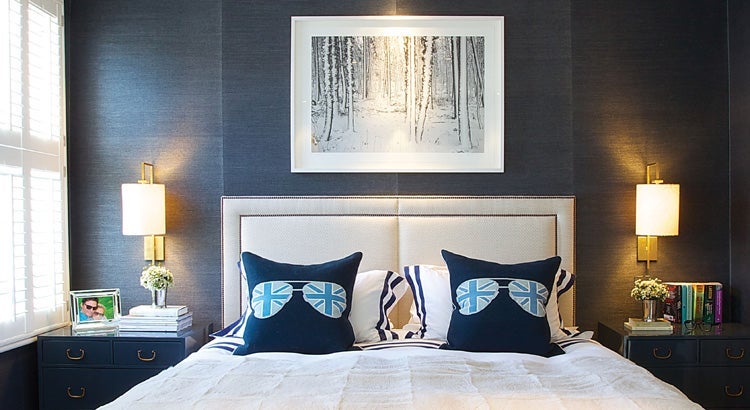
J.K. Place, a hotel on the island of Capri, inspired the master bedroom. Dark-blue grass cloth papers the walls. White trim, bedding, and an upholstered bench lighten the room and provide sophistication and a sense of calm. “I loved that bedroom,” says Pocock. “It felt like my sanctuary.”
Although earlier renovations removed many original features of the home, the design remains true to its history. “Bunny and I have such clear vision of what we’re trying to achieve that it’s easy for us to completely imagine what the final design will look like,” says Pocock. And this final design, though perfect for Pocock and her husband, was far from conventional.
WRITTEN BY RONDA SWANEY PHOTOGRAPHY BY SEAN MAYERS