FROM BLACK
TO WHITE
Exterior stonework is presented in every shade of grey; a front door and garden furniture are dressed in bold black; snow-white flowers flank the entry. The facade of this King, Ontario home provides subtle clues to what’s inside. Like the exterior, the interior dramatises stalwart neutrals of black, white, and grey.
“My clients didn’t want strong colours,” explains William MacDonald, owner of Toronto-based WillMac Design. “They like things warm and classic. There’s a lot of texture and there is colour, but it’s not over the top.”
The foyer instantly reveals the design themes found in the home: repetition of colour and shape that has been energised by a mix of textures. Black entry doors open onto grey marble. MacDonald calls the tile design a “marble carpet,” which is an apt description. The black-and-white curves in the tile repeat in iron railings found inside and outside of the home. The curved shape in the tile repeats in the round hallway mirror. The rectangular shapes of the door and sidelights are mimicked in the marble tiles, low benches, and console table.
A formal sitting room off the entry provides a master class in mixing shapes effectively. Squares and rectangles occur in the sharp angles of the fireplace tiles, firebox, tray ceiling, sofa, and artwork. Yet a round chandelier shade, corner floor lamp, and metal support structure of the side table soften those angles. Neutral colours dominate the space, but touches of blue and red accessories draw some of the focus. Bright brass sprinkled through the room offers warmth and contrasts the cooler neutrals.
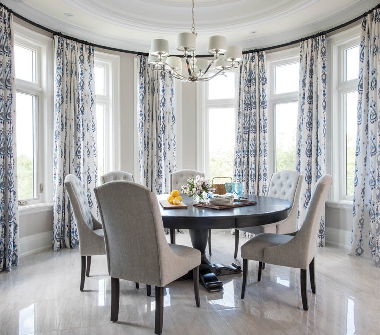
A graceful chandelier draws the eye into the dining room. “The chandelier has traditional elements but it’s been deconstructed,” says MacDonald. “The shape is elongated so the fixture doesn’t simply sit in the middle of the room.” Dove-gray velvet covers the side chairs. Head chairs use the same grey fabric but an elegant scroll covers the backs; that same fabric frames the window.
Drama continues in, of all places, the powder room. The room was inspired by a black vessel sink that the client purchased. “When I saw that sink, I said, ‘Let’s create a black powder room,’” says MacDonald. Marbleized wallpaper adds boldness, as does the touch of colour provided by oxblood shades on the sconces.
“This house is large and the rooms are big. The challenge was to use interior design to make it feel cosy and homey,” says MacDonald. That challenge becomes most obvious in the family room. In the two-story space, MacDonald used colour to ground the room with grey cabinetry at the same height as the grey drapes. Yet the height of the space isn’t ignored. The chandelier draws the eye up, as does the stencilled pattern on the fireplace feature wall. That painted pattern matches the shape in the drapery fabric.
The kitchen mixes gray-and-white cabinets and uses a diamond pattern in the glass. Gray stools with nailhead trim and silver-back rings sit next to the white-marble-topped island. The other kitchen countertops are black granite. An informal dining area partners with the kitchen. Nine slim windows circle the round dining table. That view is framed by fabric that strays from the neutral palette by adding in a cool blue. “It’s quite a bohemian fabric for such a traditional house,” says MacDonald.
A stencil artist used the drape pattern to adorn the fireplace wall. That same shape repeats in the fireplace surround and throw pillows.
Monochrome, Not Monotonous
Consider these tips from William MacDonald to help make a monochrome colour scheme more exciting.
Use touches of colour. “I advise clients to create an accessories closet to make it easy to swap things in and out,” says MacDonald. Collect accessories in the same colour family and then switch them out a few times throughout the year.
Think about texture. In every room of MacDonald’s design, the colour scheme is unified but the mix of materials within that scheme—soft leathers, plush wool, shiny metal, sparkling glass—adds vibrancy.
Mix shapes. “If you have a beige room with a square sofa, square table, square rug, and a square lampshade, it’s boring,” he says. “Go out of your way to mix shapes. If it’s all the same, it’s boring and unsettling. You don’t want to be in a room like that.”
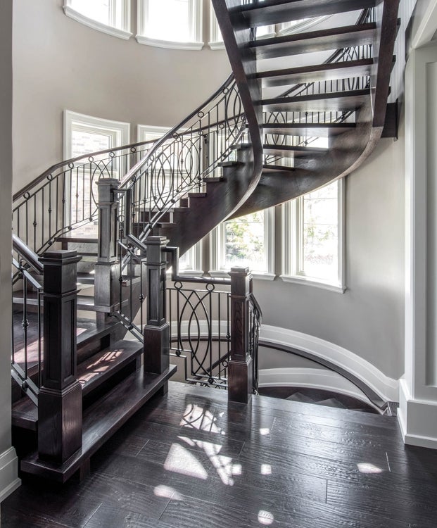
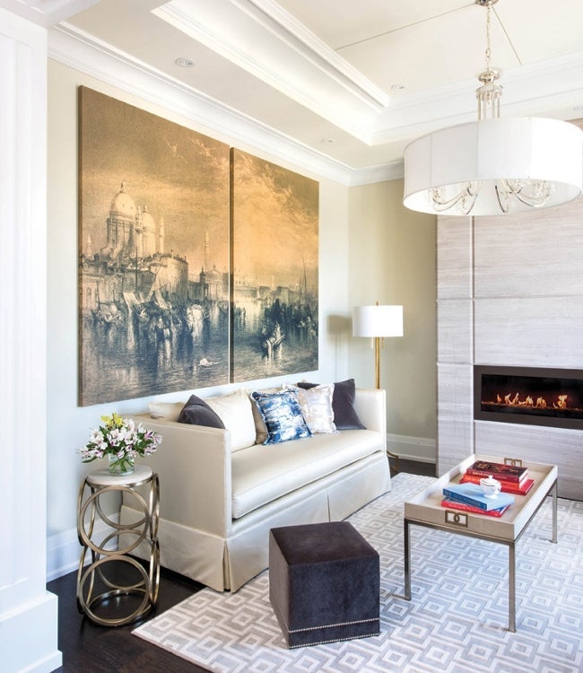
ABOVE: In an open staircase circled by windows, light and shadow become ever-changing design elements. BELOW: Calm grey and deep black turn the white island and stove surround into kitchen centrepieces. Oversize art and chandeliers make even small rooms feel grand, as in this formal living room.
Upstairs, the master bedroom animates a monochromatic scheme. The room contains nothing but shades of gray, yet each shade varies levels of shine and pattern; the lilac undertone of the simple bedding contrasts with the shimmering tufted headboard; the silvery lamp base is topped with a smooth, dark shade; and the lattice pattern on the nightstand echoes the rhythm of the carpet pattern.
Because designing an entire home takes time, it can be difficult not to stray from the initial plan. “Design is a very fluid process. Nothing’s ever set in stone until the last lamp is put on a table,” says MacDonald. Despite that fluidity, the overall vision was realised. “From our original concept, this house became exactly what we all wanted it to be.”
WRITTEN BY RONDA SWANEY
PHOTOGRAPHY BY STEPHANI BUCHMAN PHOTOGRAPHY